My design philosophy

It occurred to me, as I’m spending so much time fixing up ankiewicz.com and making new pages, that I don’t have my design philosophy recorded anywhere. Well, here it is.

My design aesthetic is all about accessibility, legibility, and simplicity. I believe every page should be responsive and easily visible on mobile devices. Pages should follow the principles of the Web Content Accessibility Guidelines (WCAG), which is a set of standards to improve accessibility. An example of a WCAG recommendation is to include ALT tags with every image, because you never know who will be using a screen reader. Wikipedia explains this well.

I also code and design using mobile first design principles. Mobile first is all about designing for smaller devices, which have more constraints than desktop, and then adding more complexity as you need it. Mobile first implies not only certain design principles—fat buttons, easy to read text, lots of whitespace, big and obvious calls to action—but also how it’s coded. In my stylesheet, the mobile styles are the default and the first thing in the file. Styles for larger devices are kept inside media query blocks as you travel down the stylesheet from small ( less than 300px) to large (more than 1200 px). It’s about designing for mobile first, rather than designing for giant desktops and then forcing an inadequate mobile design on top of that. Here are two good articles on on mobile first design:

I also favor progressive enhancement over graceful degradation. Progressive enhancement is essentially a subset of mobile first design. It emphasizes core web content first, then adding more layers of presentation and technology as the browser or bandwidth allows. Wikipedia explains it well.

Legibility is extremely important to me. I make sure to have large, sufficiently high-contrast text in a web-friendly font on all devices. Blocks of text max out at 700 pixels wide for easy scanning. I use a nice big fat serif font for reading, and a sans-serif font for titles.

You might notice that the text treatment on my web pages is similar to that of Medium. No coincidence. Medium has spent a lot of resources figuring out what makes a page nicer to read, so I figure they have already done their homework.

If you play around on ankiewicz.com, you may notice that big headers and spacious bullets on mobile devices will compress into tidy paragraphs when the screen resolution allows it. I bake in more whitespace on mobile devices for anything requiring a finger press.

I believe in using pure CSS wherever possible. Native CSS performs better than JavaScript, so I avoid making design changes using JS. For efficiency I make heavy use of the cascading in Cascading Style Sheets.

There are some glaring problems on my sites that I need to fix. I haven’t customized the imagery on my site for smaller devices. I have not optimized all of my JavaScript for performance, or minified my stylesheets and scripts. I don’t have non-script options for pages that rely on JavaScript. Oops. Sometime soon.

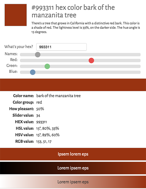
No discussion about design would be complete without discussion of color.
I believe in the emotional impact of a good color palette. I try to make use of color on every page I design. I’ve even gone so far as to make a JavaScript palette-generator, because I believe there are rules dictating which colors will look nice next to one another, and those rules can be programmed.

What I haven’t figured out is: Why does a pop of yellow work on one palette but not another? Why are super-saturated colors (especially green and red) so displeasing to me? Has there ever been a color as ugly as Lime? Is it possible to programmatically design not just a good, but a great palette, every time?

I believe everyone should know what their personal brand is. I haven’t quite nailed down mine, but I’m getting closer. This much I know is true: blueish-greens are my favorite colors, I prefer to see them near ruddy brown or dark orange, and calls to action should be big, bright, and obvious.


I’ll close out this post with one of my favorite watercolors:

watercolor by Kristen

Color sorting is an interesting problem

color palette for #336699

I love exploring colors, color theory, and color spaces. I have made several color sorting and selecting tools, including a color palettes page.

One of the challenges I encountered is that I want to show a color palette derived from a base color. Since every proper color palette should be sorted by hue, and I am not hand-picking these colors, I need to sort the resultant color set programmatically. The problem is that my current hue-sorting function doesn’t sort related colors the way I expect. You can see the sorting on this page. Notice how there’s a nice long line of perfectly-sorted greens, and then the one oddball green at the end? What’s up with Lime anyway?

I know where I went wrong. I copied the color-sorting code from elsewhere on the internet. The code, which can be seen here, does a two-fold sorting process. First it clusters colors together in a first pass, and then sorts them again on a second pass, by determining the distance between colors.

There are always outliers. The outliers are colors that are not close to anything else in my dataset, so they don’t get sorted with the rest. I haven’t figured out how to address these outliers in a visually pleasing way. The code is also so baroque that I have a hard time getting into it the weeds of it.

I have written my own color-distance functions which do simple arithmetic on the original R, G, and B values. This code can be seen here. The function limits the R, G, B values to a short numerical range. It works–it produced the palette shown above–but I am not sure if it can be scaled to a generic color-sorting function. It feels a bit hokey.

I also found this which seems to do the job, but it uses jQuery. I could rewrite it in vanilla JavaScript if I find that it gets the job done.

One of my goals is to have a perfectly fast, library-free page that puts together visually pleasing sets of color on the fly. I think it’s possible.

Let me know your thoughts on color sorting, colors, or code.

Color sliders and more fun with JavaScript

More fun with JavaScript! I made a color sliders page by connecting my revised color thesaurus to a new improved interactive hex to rgb converter. You can still see all the details of the colors, such as names, hue, saturation, brightness, red green blue values, hexadecimal code, and little stories about the colors, but the interface is all new and the code is cleaner. I removed jQuery from the JavaScript to speed up page performance, added custom sliders rather than an off-the-shelf color picker, and improved the data/definitions. I still need to test it on Internet Explorer. I may retire the original color picker once I do that.


hex and rgb color sliders

Color pickers and fun with JavaScript

I made a color picker with names by hooking up my color thesaurus to an interactive hex to rgb converter. Now you can see all the details of the colors, such as names, hue, saturation, brightness, red green blue values, hexadecimal code, little stories about the colors, and more. Let me know what else you’d like to see on this page. I’m a little obsessed with colors due to writing a novel with an artist as the main character. I also like keeping my website up to date. You can add any color to the URL and my code generates a page behind the scenes. It pulls the data from a JSON file filled with color names and hex codes.


hex and rgb color picker

Projects lost in time

A friend of mine tweeted about how he was first introduced to the web years ago by some illustrated dream pages I published. His thread of tweets, in his second language, is heartwarming. It makes me nostalgic for the early web, before social media turned huge chunks of the internet into a walled garden.

I should find those pages and publish them again. Last I saw them they were on a domain I long ago retired. I keep everything digital I’ve ever made, so I have them somewhere. If I find them I’ll put them on this blog. They were illustrated with ink and line drawings.

In the same vein, I have spent some time updating my website with paintings that I no longer own. Here’s a thickly sculpted painting I like a lot, despite not having the physical version anymore. I used tons of acrylic media, which dried up and left deep furrows in the surface. I recall using a ton of alizarin crimson and GAC (Golden Artist Colors) media:
dark red and yellow abstract painting

Did I sell this painting? Give it away? Throw it away? Unlikely, but possible. I’m guessing I gave it away. I should keep better records of physical objects. I have moved addresses many times and often give things away when that happens. I kept all the small paintings (5×5 and 8×8 inches) and a few medium paintings (10×10 inches) because they are easier to ship and store.

What about you? Do you have any projects lost in time that you’d like to recover? What are your experiences of the early web? What was the first web page you remember seeing?

On revising a novel

I have been revising my first novel, Glue, for several years now. I have a second novel in progress, The Trick, but I’m primarily focused on the first. At some point I have to send it out into the world. My goal is to find agent representation for it.

How will I know when it’s ready? How will I know when the final piece has been dropped into place and (to use a metaphor from an editor friend of mine) the heart of the novel beats? Will I forever have the nagging sense that this or that character arc or plot point could have been handled better? Will I ever really fall in love with my own manuscript?

Getting others to give me feedback helps, but sometimes it backfires. I’m still haunted by a negative critique I got from a friend who completely trashed my writing. Lesson learned: There will always be someone, somewhere, who hates your writing. Everyone’s a critic. Don’t be discouraged. My critical friend and I have a fundamentally different view of how fiction should work.

I’ve had several other people read the manuscript, and I’ve taken action on what I think was the best feedback. I’m pleased because one of my beta readers from last year has agreed to re-read the current draft. She’s my target audience, she’s got a critical eye, and she seems to genuinely enjoy my writing. I can trust her advice.

I have a push-pull relationship with the manuscript. Sometimes I think it’ll never be done. The more I read, the more room for improvement I see in my own writing. Sometimes I hear my critical friend’s words in my head.

At other times, writing is a joy. I look forward to getting my hands dirty, ripping out good writing and replacing it with better writing, pruning the story. I like getting immersed in the fictional world.

The editing process can be very satisfying. Revising is like painting. Layers are added and removed in slow succession until the final product looks nothing like the earliest draft.

What’s your relationship with your drafts? Do you like revising? Do you have that one draft that is always only 90% done no matter how much you work on it? Are you a perfectionist?

early draft of a green yellow and red abstract acrylic painting

green yellow and red abstract acrylic painting

Stygian blue, a poem

at first just a single color appeared to me
aubergine
like the faintest hint of dawn
then, a few minutes later
ultramarine
like the eyes of a newborn baby
quickly following that
coral
like so many tropical seas
before I knew it
all manner of colors arrived
in a flash of word association
bend of the knuckle
skin of the egg
russet, plum, and soursop
elderberry, date, and endive
sunburnt flesh
hyperbolic orange
stygian blue

abandoned car in Death Valley

Glue, a poem

I make art
one drawing after another
some with leaves in the trees
some with no leaves
some with brown grass
some with green
watercolors flow from brushes
onto tree-filled landscapes
collages arise from construction paper
red, yellow, green, and blue
pasted together into intricately detailed shapes
I love the waxy feel of crayons pressed hard
scratched-off layers of wax
paper bent from watercolor
swirls of colors that haven’t fully dried
I love the stiff feeling of clay that hasn’t been pulled yet
the softer, warmer feel of it after it is kneaded
the feel of paper stuck to paper
the smell of glue

intricate collage

The sequence above was taken from my novel-in-progress Glue and finessed a bit to turn it into a poem. The main character is (like me) an artist and (unlike me) likes making collages. I made the collage above when I was a college student. It is a study of the scene outside my dorm window.

Colors, a poem

I dreamt of color
cerulean blue
cadmium orange
antimony yellow
pyrrole red
sage, russet, and plum
persimmon, vermilion, and rose
gamboge, the color of resin
falu, the color of Swedish cottages
I saw breathing walls
breathing hands
dancing cobblestones
moving words
swirls of smoke
shirts that rearranged their fibers
tints that mixed and floated away
chimerical, hyperbolic, imaginary
a halo of a fade of a wash


Image source: Plants and Their Application to Ornament (1896)

Writing tips for those with little time

With a full-time job, social life, family, and other obligations, you may find it difficult to find time to write. Here are five tips for finishing that project in a time-boxed manner.

  1. Get your butt in that chair. You may be familiar with the “butt in chair time” concept if you work in technology or other demanding field. The idea is that you’re not putting in the work unless you’re present at your desk. That’s a terrible concept in the workplace, but it’s fantastic for writing. I have some good news and some bad news: Your muse? She doesn’t exist. If you wait for your muse to show up before you sit down to write, you’ll never finish that poem/project/novel. What counts in writing is butt in chair time and fingers on keyboard time (or pen on paper time, if you roll that way). Sit there. Even if nothing is happening. Learn to love writer’s block. Eventually, the words will come.
  2. Read, read, and read. When it’ s not your allotted time for writing, read some more. Reading is absolutely the best way to learn how to write. Pick books that are totally different from your writing style, very similar to your writing style, and everything in between. If you’re writing a romance, read plenty of romances but also plenty of mysteries, and vice versa. Get some inspiration. No, browsing the web doesn’t count (see below).
  3. Shut down social media. Close those tabs. Your BFF can wait for you to post that kitten photo another day. You can hold off on looking at your BFF’s kitten photos until another day. All the kitten and puppy photos will still be there, when you’re done writing. Prioritize the writing.
  4. Don’t write and edit at the same time. Editing is by nature a destructive act. It must be done, but when you are there to create, just create. Save a separate allotment of time for editing. When you’re in revision mode, then you can put on your editor’s cap. Separate the two. Say, Saturdays are for revisions, and Sundays are for adding more words. When you’re there to add words, resist the urge to go back and change what you’ve already written.
  5. Set a schedule. Whatever you have time for. I set aside 2-3 hours a day in the evening. Whatever it is, stick to it. Make it regular. Get your coffee/herbal tea/snacks lined up. Free yourself from distraction. Get someone else to do the dishes/do the laundry/babysit the kids for that precious hour or two. You’ll be surprised what you can write in a short period of time once you stick to the schedule. When the time is up, stop writing! This may sound counterintuitive, but you can’t write if you never recharge. Eventually you’ll train yourself to write on the schedule, recharge off the schedule.

closeup of a notebook


Color names for writers

I have made a collection of named colors gleaned from HTML color names, Pantone swatches, stones, jewels, flowers, foods, minerals, pigments, and paints. Some of them I made up out of whole cloth. Each color is presented as its hexadecimal code. Use some in your fiction! Sample color names:

  • Gamboge
  • Despair
  • Malachite
  • Flesh of the peach
  • Skin of the peach
  • Wine
  • Mahogany

You can use the complete interactive version here.

Download the whole shebang as a PNG file. Please share it! Below is a cropped bit from the reds section.

excerpt of color names for writers

Werner’s Nomenclature of Colours (1814)

I found this fascinating text on The Public Domain Review, which is a treasure trove of copyright-free works, both images and texts. Extending Werner’s system, this is Patric Syme’s classic taxonomic guide to the colors of the natural world.

Patrick Syme, Werner’s nomenclature of colours; Edinburgh: William Blackwood, 1821.

WHITES.

1. Snow White, is the characteristic colour of the whites ; it is the purest white colour ; being free of all intermixture, it resembles new-fallen snow.

2. Reddish White, is composed of snow white, with a very minute portion of crimson red and ash grey.

3. Purplish White, is snow white, with the slightest tinge of crimson red and Berlin blue, and a very minute portion of ash grey.

4. Yellowish White, is composed of snow white, with a very little lemon yellow and ash grey.

5. Orange-coloured White, is snow white, with a -very* small portion of tile red and king’s yellow, and a minute portion of ash grey.

6. Greenish White, is snow white, mixed with a very little emerald green and
ash grey.

7. Skimmed-milk White, is snow white, mixed with a little Berlin blue and
ash grey.

8. Greyish White, is snow white, mixed with a little ash grey.

colors